by Scott Newton | Apr 22, 2018
Exploring some font choices with RightFont, trying to see how some fonts I was thinking of using look with the actual wording
Throwing around some ribbon graphic ideas within Sketch
Further along in the logo development process with two different ribbons and the “o” turned sideways
Final approved logo, decided on colored “o” over ribbon
Trying the logo out on a very early version of the website to see how it works out

by Scott Newton | Apr 22, 2018
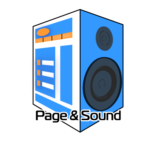
Page and Sound Logo
The hardest client is myself
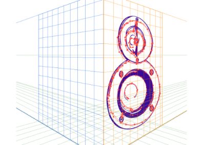
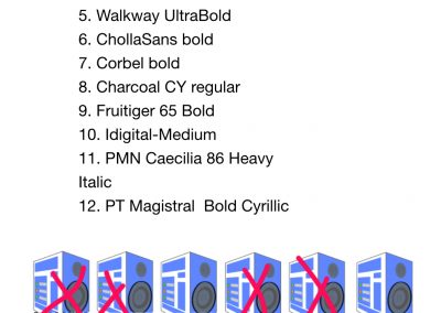
Here’s a bit of the process I went through making the logo for my own business. The concept of using a 3-D image of a speaker and splitting half of it into a web page was the idea I came up with, and used my own monitor as the model. The first image shows how the Illustrator project started with the 3-D grid. Once that came along I made the next image to help narrow the fonts down (I started with a lot more than 12!) The last two images show some small changes I made at the end. Logos need to be simple and I initially had something that was too complex. I simplified graphics and colors until I had something I thought was just right to get my idea across.
